
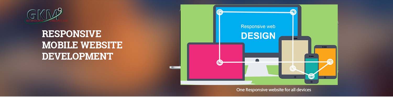
Responsive Design is an approach to web development which makes the website design compatible across devices like smart phones, iPads and other tablets. This coding practice gives the website the exact look on the mobile devices as on laptops or desktops.
Off-late a large percentage of our clients are demanding responsive designs for their websites. We’ve honed our skills in responsive design implementation and have built a solid portfolio over time.
Bootstrap is ‘mobile-first’ front end framework by Twitter that allows for developing websites and custom applications that are cross-browser and cross-device compatible (responsive